SPACE |
|
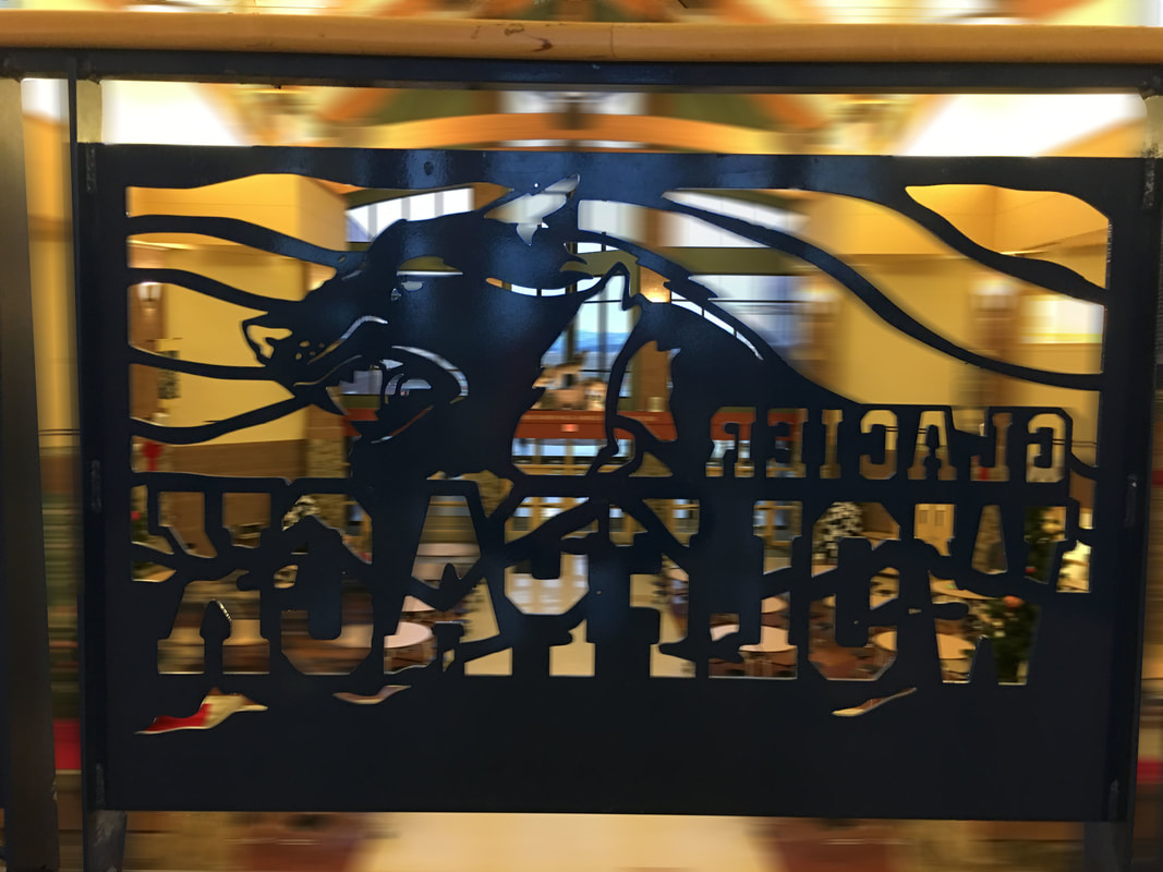
For space, I took a picture of the railing above the commons. I went in to photoshop and blurred the background and everything that was not in the "glacier wolfpack" part of the rail so you could see the element of space better.
|
COLOR |
|
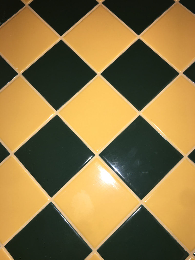
I chose this tile pattern for my color element because the way that the light reflects off it makes it pretty. I like the way that yellow and the green compliment each other.
|
VALUE |
|
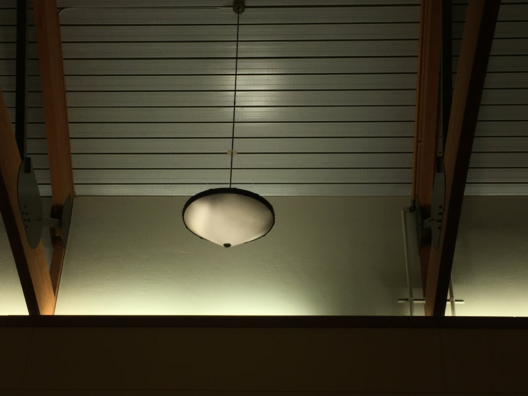
I chose this light above the stairs for my value picture because I liked how the light created a gradient from light to dark.
|
TEXTURE |
|
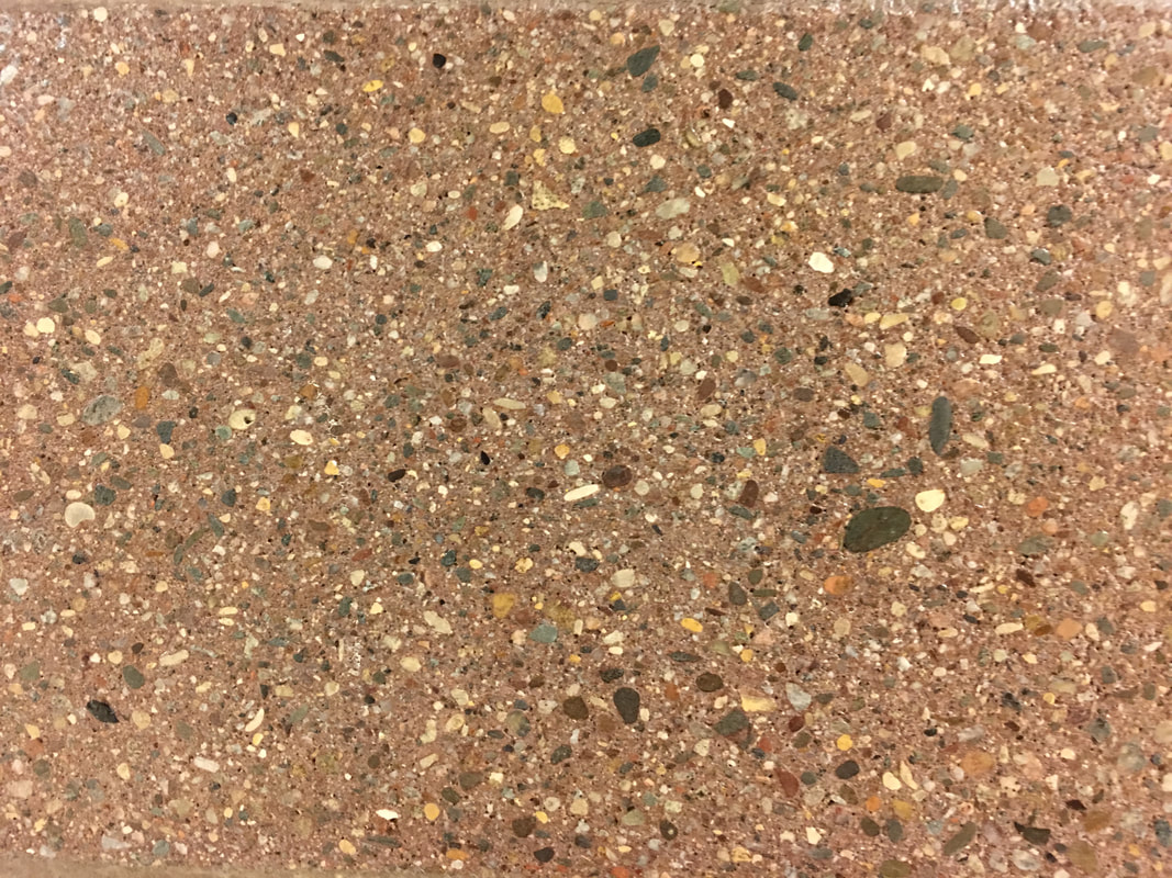
I like this photo of the wall for the texture element because the rock like minerals on the wall almost look like rocks on a beachy sand.
|
FORM |

|
I used this for the form element of art because you can see that the object is 3D and you can notice the raised edges of the ornament that pop up. This object also shows depth and you can tell that the object contains a volume.
|
SHAPE |
|
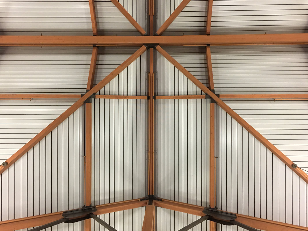
I photographed the ceiling of the school for shape because not only are there different shapes in all the white lines, but also there are many different shapes that the brown wood is making.
|
LINE |
|
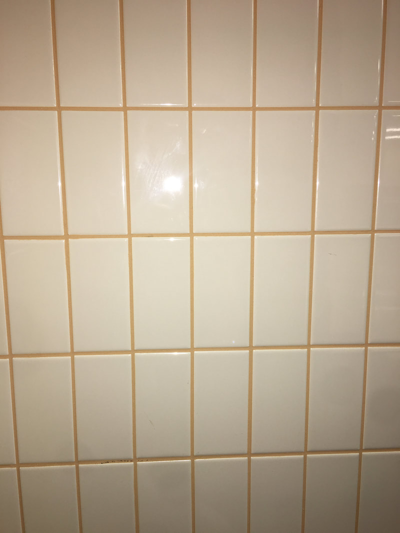
I used this wall from the cafeteria for line because it has even lines both vertically and horizontally. The lines are even and it just looks like a continuous line of squares and rectangles all made by the same lines.
|
