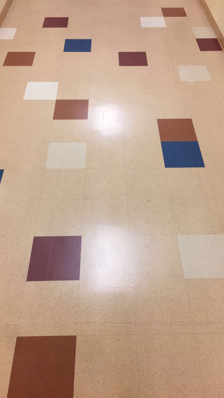
UNITY |
|
I chose his for unity because all of the opposing colors come together to complete the picture and all the parts come together.
|
RHYTHM
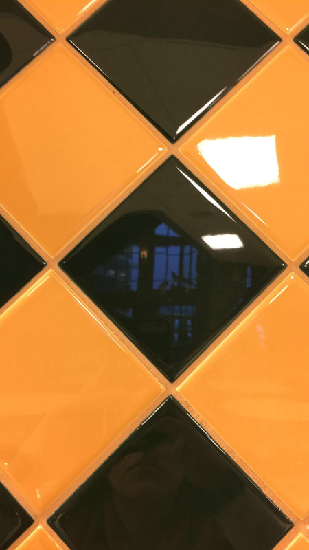
PATTERN |
|
I chose this for pattern because it is a continuous pattern of green and yellow. Also, the shape is the same through the whole image fitting in with the pattern element.
|
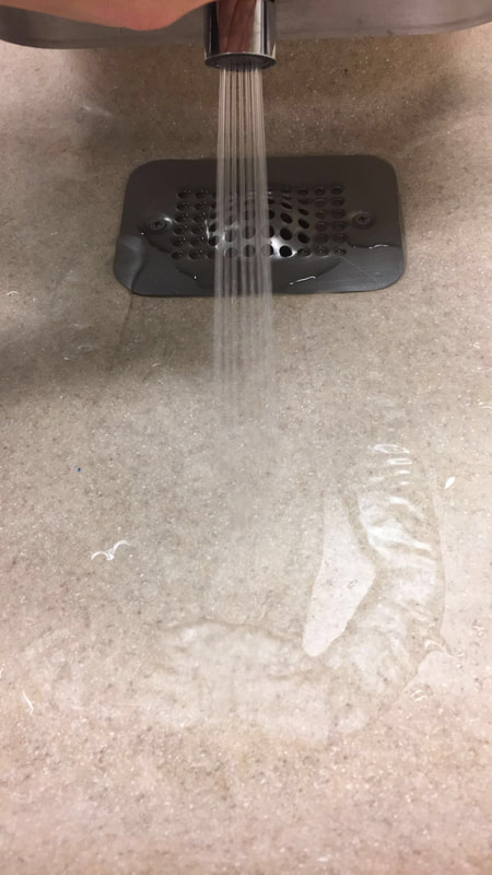
MOVEMENT |
|
I chose this photo for movement because the photo does a good job of showing how the photo looks like it is actually happening. It looks like water is coming out at this moment and almost looks like a video.
|
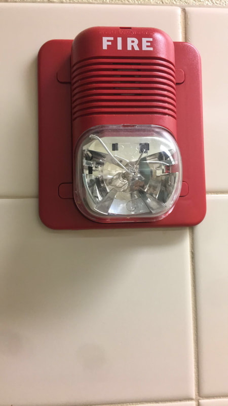
EMPHASIS |
|
I chose this for emphasis because the red fire alarm that is sticking out stands out with the flat tile background behind it. I also like how the bolded fire stands out as well.
|
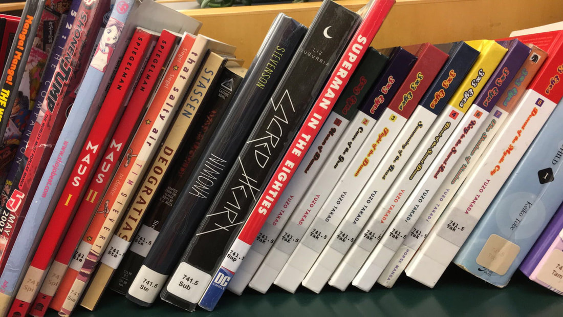
PROPORTION |
|
I chose this photo for proportion because it shows different books that are different sizes and shapes.
|
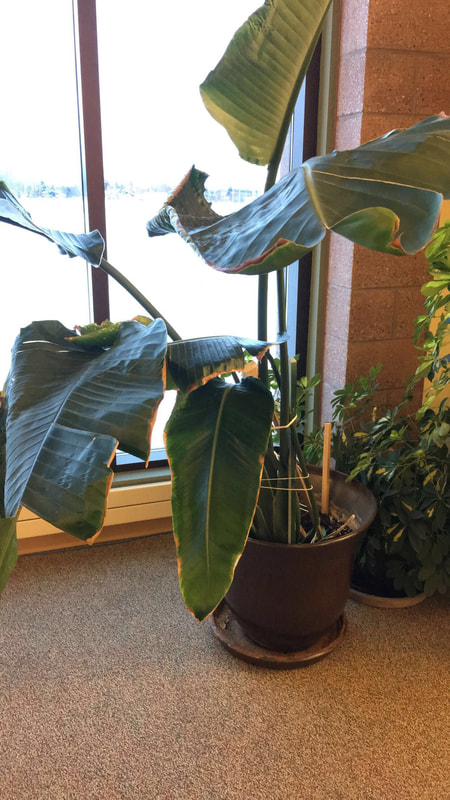
BALANCE |
|
I chose this for balance because you can see the weight of the object in the photo. The plant also shows a lot of space which also plays into balance. Also, the colors in the photo balance each other.
|
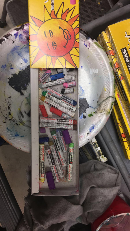
VARIETY |
|
I chose this for variety because it shows multiple of the same object multiple times but there are a variety of colors that display the principal well.
|
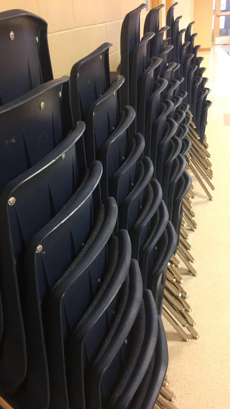
REPETITION |
|
I used this for repetition because it shows the same row of chairs over and over again showing good repetition and does a good job of showing the principal.
|
